YouTube, the time-wasting creation of the century. Elements of art and design certainly does not seem to fit in with the daily: music videos, parodies, and just plain annoying Rick-Rolls. Wait, can’t YouTube videos be considered an art form, too? To gain a proper perspective, Art Burst Chicago (A.B.C.) talked with photographer and YouTube video artist Connor Sullivan (C.S.).
Sullivan considers himself to be a jack-of-all-trades in the art community. A student at the University of Illinois-Chicago (UIC) during the day and a painter, director, and photographer by night, art is his therapy. Concerned more with the process than with the end result, Sullivan was more than open to revealing his thoughts.
A.B.C.: In your opinion, is YouTube a medium, an outlet, or a blank canvas?
C.S.: Ah, YouTube. It’s a blessing and a curse. It is more of an outlet than anything. It’s a very simple and user-friendly way for absolutely anyone to put anything out into the world. Whether it’s art, politics, music, jokes, skits, news, cats; you name it it is on YouTube. I love it. It is an easy way for me to share my love for video making.
A.B.C.: Your channel name is RonnocNavillus, your name spelled backwards. Does your work have a backwards or non-linear style?
C.S.: I wouldn’t say I have a particular style. I just get random ideas and translate them into videos.
A.B.C.: Who are your inspirations?
C.S.: My inspirations are vast. Adam Grossi is number one. He was a graduate student at UIC, and inspired me to pursue art as a career. Another UIC faculty member is Pamela Fraser. Her work in color theory has really influenced my own work. In terms of big name artists, [Francisco] Goya is someone I like to think of when I am painting (specifically his black painting series). I could go on for days talking about film inspirations, but the man that started it all was my Humanities teacher Steve Welch, in high school, who introduced me to the idea of film as an art form and not just entertainment.
A.B.C.: Since YouTube is relatively new, do you feel that it will continue to be a relevant site in the future?
C.S.: I think that YouTube will keep growing strong. Its main aspect is that it is free. There are rival sites coming up such as Vimeo (which is more artistically based). But YouTube has such an enormous audience right now, that I don’t think any video site will ever be as popular or effective for getting your ideas out there. If YouTube ever goes down, or becomes a pay site, well, let’s just say hopefully I have made a name for myself before that happens. But who knows, with new social networking sites appearing every day, I’m sure there will be something new.
A.B.C.: Your videos are very modern. You have a video titled “ink drop,” where you film ink being dropped into water. First would you consider this to be modern art?
C.S.: Honestly, I don’t really think of them as “art” that much. That video in particular, I was just doing some experiments with ink and water for my own fun/knowledge and thought that it created something visually pleasing and really beautiful. Then I thought people might want to see this.
A.B.C.: Second, how do you come up with your videos?
C.S.: A lot of my videos are spur of the moment, without a lot of prior thought put into them. Part of this is because I love the process of making a video; the editing, filming, posting, it is all exciting to me.
A.B.C.: You are also into photography; how has this influenced your videos?
C.S.: It influences my videos a lot, but in a good way and it is kind of subconscious now. The way in which I think about setting a shot up is affected. It is kind of hard to explain, but you think about all of the rules in photography, such as rule of thirds, and framing and depth of field and apply those to video making.
A.B.C.: Do you find a receptive audience on YouTube and social networking sites?
C.S.: For the most part people are pretty receptive on both YouTube and FaceBook. I get a lot of “likes” and good comments. I am not really concerned with people who don’t like it. I think most people probably consider my work to be entertainment more than anything and that doesn’t bother me.
A.B.C.: You work hand-in-hand with fellow photographer and video artist Christopher Bauer (Such as in “Born this Way“). How has this affected your work?
C.S.: Collaborating has only made my work better. It is one of the hardest things to do. You have to compromise your ideas and give up full control, but meshing ideas and getting different perspectives on how things could be done differently is great. We work really well together also. We really feed off of each other’s creativity. Now I don’t make a video without getting his input first.
A.B.C.: Where do you see yourself in the coming years?
C.S.: I think I will always be on YouTube as long as it exists. It’s a good to way to just have an archive of work if nothing else, but I will still be coming up with new pieces, sketches, etc. And like anyone else I want to get that one video that reaches a million views.
As most YouTube posters know, the site does not come without hiccups. According to Sullivan, “our Lady GaGa video ‘Born this Way‘ was uploaded the day the song was released. In the period of three days, it gained over 7,500 views. That was until YouTube took it down because GaGa had yet to clear the song for copyright infringement. Now it has been re-uploaded but it will never gain the hype it had because of how many other gaga videos are out there.”
For more information on Connor Sullivan’s work, click here (his YouTube channel). Art and design in the digital age, what will the future of art and film be? No one can be certain, but the Internet will surely open up further possibilities for artists and directors such as Connor Sullivan.


 A still from “SICK/SLEEP”
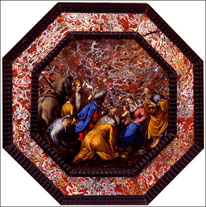 “The Adoration of the Magi” by Bassano
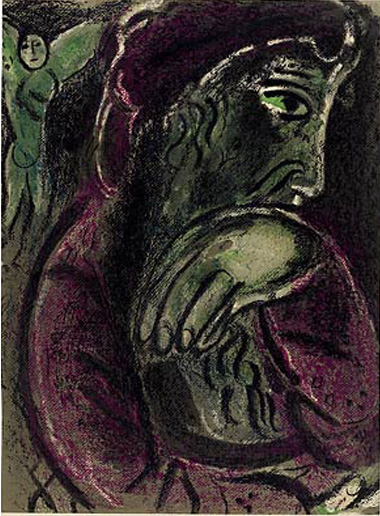 “Drawings for the Bible—Job in Despair” by Marc Chagall
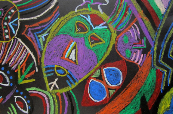 “African Mask Composition” by Niamani Smith


 “Buyer”
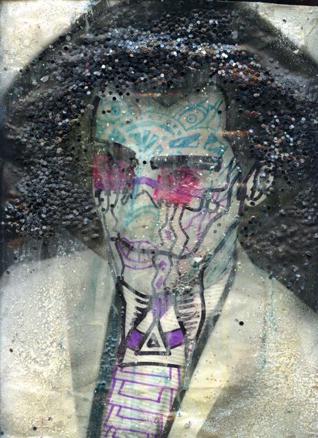
 “Keep doing it”
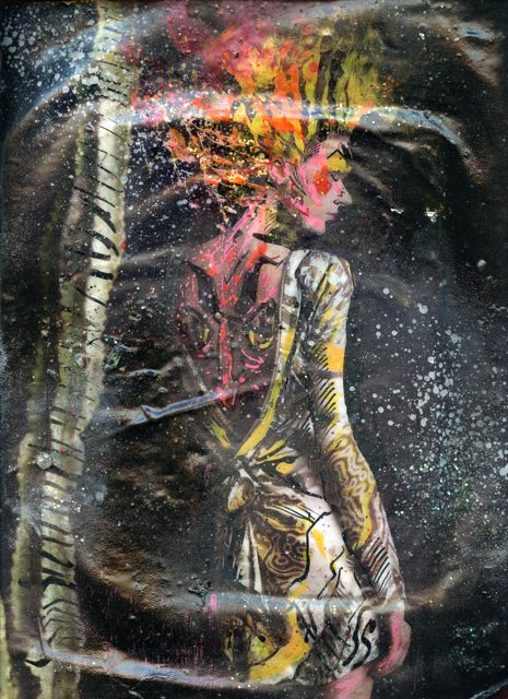
 “Found it”
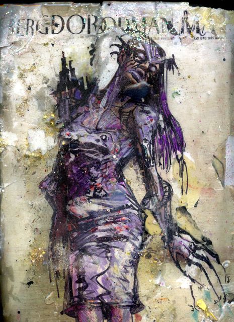


